The colors we thoughtfully select for our walls play an important role, serving as the backdrop to how we live within our homes. More than purely decorative, color is emotive and can enhance how we feel about our personal spaces.
A simple paint shade can have an immense effect on our emotions, happiness, and well-being. Getting the color scheme right has never been more key for creating a contented happy home.
Paint trends 2021 – influential colors to watch
Our homes are our own personal sanctuary, a space where we want to feel safe, comforted and – above all else – happy. And that has never been more important than right now, as we spend more time at home than ever before. So which colours should we be looking to for 2021, to provide a the right tone for the landscape ahead.
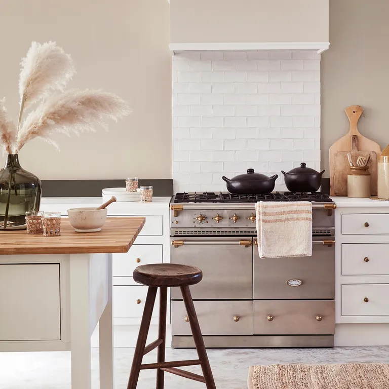
1. Restorative new neutrals
There’s been a resurgence in recent years of more milky and almond toned neutrals, as opposed to the colder tones feature on the greyscale.
‘I see 2021 as being a year of creating cocooning, cozy spaces, there will be a shift away from the cooler greys, and warm neutrals such as ‘Oak Apple’, ‘Mushroom’ and ‘Bath Stone’ will become the go-to tones,’ explains Ruth Mottershead, Creative Director Little Greene.
‘These colours are perfect for creating restful living spaces that bring a sense of comfort to the home. These more neutral tones work fantastically as a base from which to introduce a colour highlight on the skirting boards or a door.


Get the Look: Coffee Mugs, Travel Mugs, Coasters, Serving Trays, Cutting Boards, Side Tables, Credenzas, Counter Stools, Bar Stools, Benches, Coffee Tables, Rugs.
2. Calm inducing grounded tones
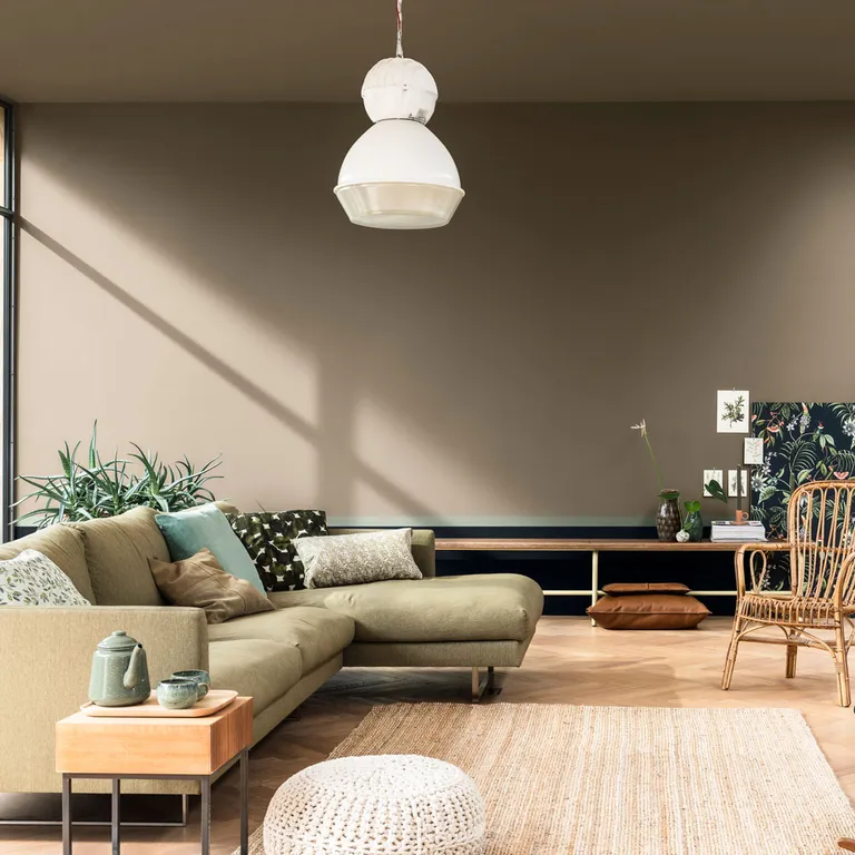
Revealed as Dulux’s Colour of the Year 2021, Brave Ground has been carefully selected to neutralize our homes in 2021.
This earthy shade aims to create a safe space in which we can take comfort from the changing world outside. The paint experts at Dulux have identified the warm and grounding neutral shade as ‘the colour that will enable people to draw upon the strength of nature to help them find the courage to embrace the future.’


Valspar shade ‘Brown Bunny’ is set to be a key trend for 2021, giving a premium and luxury feel to interiors. This warm and earthy shade is perfect for creating a chic and contemporary scheme with homes for the year ahead. The delicately light brown matches perfectly with sleek modern furnishings, gold fixtures, and green accessories to achieve a sophisticated elegance.
‘We’re constantly battling being busy in all aspects of life and more and more we’re seeking respite from stress with products, tools, and services that balance our fast-paced lifestyles’ Sue Kim, Valspar’s Senior Design Expert. ‘Creating a welcoming interior to come home to will reduce feelings of anxiety to allow you to really enjoy the space you’re in. Neutral tones such as ‘Brown Bunny’ are restful, yet stimulating and help to create a clean and balanced design. Chalky whites also blend quietly with these colors so you are left with a calming interior that will rejuvenate your mind after a busy day.’


Get the Look: Coffee Mugs, Travel Mugs, Coasters, Serving Trays, Cutting Boards, Side Tables, Credenzas, Counter Stools, Bar Stools, Benches, Coffee Tables, Rugs.
3. Lush landscapes of serene green

Is green the new grey? It’s everywhere in interiors right now. It’s synonymous with nature and calming qualities, which could explain it’s popularity for creating a contented home.
‘Green is quite simply luscious in the truest sense of the word’ exclaims David Mottershead, MD of Little Greene. ’From velvety dark greens to the light and uplifting tones, greens can be used all over the home and have a powerful, restorative quality. Used in home offices, green shades aid contemplation, and deep thought.
Use your walls like a landscape of surrounding fields. Whether you live in the country or aspire to call it home, painting walls in lush green is a step closer to feeling at one with nature. All of the paint experts are in agreement that is homes will be embracing green more than ever next year.


‘Bringing the elements of the natural world into our interiors encourages personal growth as well as evoking a feeling of calm’ explains Farrow & Ball’s color curator Joa Studholme. ‘All greens reinforce our connection to nature and create the perfect welcoming start to the journey through your home’.
Green is a particularly popular choice to breathe new life into living rooms and create a feeling of tranquility in bedrooms.


Get the look: Floor Poufs, Rugs, Floor Pillows, Throw Pillows, Blackout Curtains, Throw Blankets, Tote Bags, Backpacks, Duffle Bags, Benches
4. Backdrops of beige

It’s been noted that the new neutrals are harking back to beiges of days gone by. Remember ‘Natural Hessian’ and ‘Calico’ of the 2000s? They are back but with new names and shades, as we welcome neutrals with a warmer undertone to that of greys.
Perfectly timed for the rise of the new neutrals is a new shade at Earthborn. Launched as part of the new ‘Earth Collection’, Crocky Road is predicted to be one of the most coveted tones of 2021.
‘Our brand-new colour Crocky Road is set to be a hugely popular shade in interiors next year’ says Cathryn Helsby, Head of Creative Marketing, Earthborn. ‘This natural, cool beige with a faint green undertone carries a calming, easy-going, earthy quality. A perfect color to live within both a modern and traditional home and wonderful to pair with pops of bright accessories.’


Neutral wall color can go a long way to creating a soft and warming interior space. A strong neutral provides the perfect backdrop to compliment trendy darker hues or statement furniture pieces.
Get the look: Rugs, Floor Pillows, Throw Pillows, Rectangular Pillows, Side Tables, Coffee Tables, Blackout Curtains, Throw Blankets, Coffee Mugs, Coasters, Serving Trays, Wall Hangings.
5. Notes of delicious Olive green

Our style team have been noting the abundance of Olive green springing up in new season trend collections. And here are what the experts say on the shade…
‘In the bedroom olive green can help to create a serene environment,’ says Charlotte Cosby, head of creative at Farrow & Ball. ‘it’s also suited to rooms that overlook nature. The colors from the great outdoors will further enhance the green tones of the walls and create a relaxing outdoor feel in your home.’


‘Paler olive has a grey undertone, so works naturally with soft greys – a combination that’s extremely calming and peaceful,’ says Judy Smith, a consultant at Crown. ‘With this look, keep to a tonal palette and paint woodwork the same color as the walls to give a harmonious feel.’
‘Olive green is a great color for east-facing rooms,’ says Cathryn Helsby, marketing manager, and color expert at Earthborn. ‘These spaces often have green/blue undertones and it’s best to play to this. Similarly, olive would also work well in north-facing rooms: instead of competing with the lack of light, we recommend embracing it.’


Get the Look: Coffee Mugs, Travel Mugs, Coasters, Serving Trays, Cutting Boards, Side Tables, Credenzas, Counter Stools, Bar Stools, Benches, Coffee Tables, Rugs.
6. Warming reds and mulberry tones

In times of uncertainty, such as now, we often crave warmer tones that will enrich our homes and create a cocooning sanctuary to shut ourselves away. Moving away from charcoal greys and navy blues, with a colder outlook, 2021 steers towards the warmer tones of reds and plum. These rich saturated hues are effortlessly chic by day and cozy by night, welcoming a grounded but luxurious atmosphere to any room.
‘Bold yet natural pairings are also on-trend, with strong greens being paired with striking tones such as ‘Chocolate Colour’, or rich ‘Baked Cherry’ in combination with ‘Invisible Green’ to create dramatic yet intimate and inviting interiors’ explains Ruth Mottershead, Creative Director Little Greene.


The richness of Graham & Brown’s Colour of the Year 2021 – Epoch is just the thing. This emotive shade directional shade of plum, has us wanting to hunker down for the winter months – sat by candlelight and wrapped in warming layers. This is just what the design team had visions of, describing it as, ‘A calming, cocooning tone, Epoch echoes a wider interiors trend which looks to create restful spaces for healthier, happier homes’.


Get the Look: Coffee Mugs, Travel Mugs, Coasters, Serving Trays, Cutting Boards, Side Tables, Credenzas, Counter Stools, Bar Stools, Benches, Coffee Tables, Rugs.
7. Cleaner shades of blues

Another calming color that pays homage to the natural world is blue. Always a popular choice for decorating, this watery marine shade helps to add serenity to any room. But how is this hue changing for our tastes in 2021? ‘The blues best suited to anchoring our homes in 2021 are cleaner tones like lively Pitch Blue, fresh Ultra Marine Blue, and the darker, inkier Stiffkey Blue’ Farrow & Ball’s color curator Joa Studholme. ‘These uncomplicated shades feel familiar, like memories from our childhood, so have a soothing effect in the home despite their cooler undertones.’


Get the Look: Coffee Mugs, Travel Mugs, Coasters, Serving Trays, Cutting Boards, Side Tables, Credenzas, Counter Stools, Bar Stools, Benches, Coffee Tables, Rugs.
8. Naturally perfect pigments

Present in the global trends last summer, it’s set to be ever more present in the coming seasons. We are of course talking about the use of earthy tones. Pinterest revealed searches for ‘terracotta walls’ increased by 86 percent, year on year, in the UK in 2020. These rich, warm shades sit in a color palette of plaster pink, burnt orange, spiced ochre, and charcoal black – all pigments drawn from natural materials.
Crown has called this the ‘Naturally Perfect’ trend. For which Justyna Korczynska, from the Crown Design Studio, says, ‘The ultimate goal is to achieve a flawless, yet natural look. Makeup gives us confidence and makes us feel better about ourselves. Naturally Perfect presents beauty tips for an interior design using a warm color palette of powders and blushers.’


Get the Look: Floor Pillows, Throw Pillows, Pillow Shams, Rectangular Pillows, Duvet Covers, Comforters, Throw Blankets, Rugs, Framed Prints.
9. Expressive accents

While many of the trends are paired-down, there’s one such trend that is ready to shout! That is the expressive trend, where color is made to stand out. Used as accents this trend sees braver colors adding vitality and a punch of personality to our homes.
‘I feel color trends will move into deeper richer tones. With burnt oranges, deep yellows, and warm browns such as ‘Muga’ and ‘Rufus’ both as accents and statement tones. Alongside the ever-popular deep greens and blues of colors such as ‘Teal’, ‘Plimsoll’, and ‘Blue Blood’’ explains Andy Greenall, Head of Design, Paint & Paper Library.
‘As well as a renewed focus on rich warm colors, I feel 2021 will see consumers focus on the power of finish. And the effect it has on the use of color. I think finishes will be used in surprising situations to add to the atmosphere of a design scheme. From velvety soft, chalky matt finishes to high sheen dramatic gloss on walls and woodwork – finish will become as important as color.’
With so many glorious trends, there’s never been a better time to splash out on a new paint colour.


Get the look: Mini Art Prints, Framed Mini Art Prints, Art Prints, Framed Prints, Canvas Prints, Metal Prints, Wood Wall, Art Posters, Wall Hangings, Wall Murals, Wall Tapestries.
The post Paint trends 2021 – the colors set the tone in our homes for the year ahead appeared first on ARTERESTING Bazaar.
Source: https://bit.ly/2Sdx5tT
Comments
Post a Comment